My Role
UI/UX Design
Duration
10 Months
Devices
Web / Mobile
Challenge
Balancing business needs with user experience
The revision was a challenging task for several reasons. The ordering system had to navigate a complex scenario, serving both business clients (B2B) and consumers (B2C). Within a tight timeline, we had to revamp various features accumulated over the years, all while ensuring the system’s normal operation, as many restaurant clients and consumers continued to use it daily.
This revision was not just a change in visual style but crucial to delivering a seamless experience for our clients. We needed to reassess the product’s processes, visual elements, and structural hierarchy to provide users with a smoother ordering experience. Striking a balance between business and customer support needs, technical feasibility, user demands, and commercial goals made this project particularly challenging.
Solution
Pain point analysis and strategic planning
Pain Point
The operational process is chaotic and not smooth.
Accumulated features over the years lack unified standards to follow.
UI components from different periods result in inconsistencies.
Strategy
Enhance user experience:
Reassess and clarify the integration process of all features.
Establish comprehensive standards:
Define detailed specifications and create guidelines.
Consistency in UI components:
Design a new version of the interface.
Our Goal
Optimize processes and
refine the design
Considering the existing usage habits of restaurant clients and consumers, no major features will be added at this stage. However, the needs of other merchants and users will be optimized as part of this project.

So why did we do this?
Integrating business, user, and technical department requirements to drive the system revision
Business/ Operation Customer Service Department
Many existing restaurant clients have reported issues and requested feature improvements, but the current page has too many limitations, making it difficult to further enhance the product.
Restaurant Clients/ Consumers
The user experience is hindered by frequent lag and sluggish performance, and the page flow and logic feel outdated and somewhat disorganized.
Technical Department
The user experience, combined with the accumulation of technical debt, makes it difficult to scale the previous application design and architectural processes, especially when expanding across multiple technology stacks.

Next Steps…
To improve product experience and achieve consistency, we must consider both B-end and C-end users. This involves completing subsequent pages based on technical resource allocation for a better ordering experience.
• Follow-up Optimization Plans for
Phases 2 and 3
• Consistency Adjustments in UI
(Other Pages)
• Web Version Optimization
(RWD)
Insights and Takeaways
Communication and Collaboration During Development
During the project initiation phase, the business department presented various system improvement requests from restaurant clients and consumers. However, the technical department needed to prioritize internal system adjustments and operational demands, which delayed progress. To address this, the product department held multiple meetings for cross-department coordination, dividing the ordering system into three parts and setting achievable launch goals to ensure alignment.
As a UI/UX designer, I analyzed several competitors, discussing ways to improve user issues without changing the system process. I aimed to balance design direction with business needs and enhance user experience, showcasing my professional skills.
Key Learnings and Reflections
This optimization project for the online ordering system highlighted the importance of effective communication and collaboration. While improving the outdated interface and processes, I learned to balance differing opinions and adapt to changes. This experience reinforced the value of continuous learning and an open mindset for enhancing design quality and fostering innovation in future projects.
Interested in connecting ?
Let’s talk projects, collaborations,
or anything design !

My Role
UI/UX Designer
Duration
10 Months
Devices
Web / Mobile
Product Development
Wireframe
About
An online ordering system with delivery and self-pickup options
This is an online ordering system for consumers, supporting both delivery and self-pickup options. Users can access the system via the web and the official LINE account, and it can integrate with the POS system, making it suitable for both brand chains and single-store merchants.

Prototype and Functional Highlights
Background
Background
Revamped interface to enhance the ordering experience
Revamped interface to enhance the ordering experience
The company is a startup SaaS provider for restaurant systems and the largest Android POS system provider in Taiwan, supporting multiple devices within a single store. Its online ordering system is used by over 4,000 restaurants and serves more than 7 million members.
As the number of users grows, the existing web interface appears outdated, and both the process and user interface require optimization to enhance the user experience. Our goal is to improve the interface design to provide a better ordering experience for both restaurant clients and consumers.
Team
PM
Designer
Front-end RD
Back-end RD
QA
Freesia, Aggy
Shani
River/ Yu/ Roy
Nicole/ Ian/ Anthony
Oliver/ Allan
My Role
My Role
End-to-end design / Establishing the design system
End-to-end design / Establishing the design system
As the sole designer, I was responsible for collaborating with cross-functional teams in the early stages to explore requirements and define user flows in coordination with the PM. I took full charge of designing, creating prototypes, and establishing the Design Guidelines. I worked alongside engineers to ensure consistency and took part in product testing and validation to guarantee the design was implemented as intended, meeting both project goals and user expectations.
As the sole designer, I was responsible for collaborating with cross-functional teams in the early stages to explore requirements and define user flows in coordination with the PM. I took full charge of designing, creating prototypes, and establishing the Design Guidelines. I worked alongside engineers to ensure consistency and took part in product testing and validation to guarantee the design was implemented as intended, meeting both project goals and user expectations.
Restaurants Clients
member Users
About
An online ordering system with delivery and self-pickup options
This is an online ordering system for consumers, supporting both delivery and self-pickup options. Users can access the system via the web and the official LINE account, and it can integrate with the POS system, making it suitable for both brand chains and single-store restaurant clients.
Challenge
Balancing business needs with user experience
The revision was a challenging task for several reasons. The ordering system had to navigate a complex scenario, serving both business clients (B2B) and consumers (B2C). Within a tight timeline, we had to revamp various features accumulated over the years, all while ensuring the system’s normal operation, as many restaurant clients and consumers continued to use it daily.
This revision was not just a change in visual style but crucial to delivering a seamless experience for our clients. We needed to reassess the product’s processes, visual elements, and structural hierarchy to provide users with a smoother ordering experience. Striking a balance between business and customer support needs, technical feasibility, user demands, and commercial goals made this project particularly challenging.
Why did we do this?
Integrating business, user, and technical department requirements to drive the system revision
Business/ Operation Customer Service Department
Many existing restaurant clients have reported issues and requested feature improvements, but the current page has too many limitations, making it difficult to further enhance the product.
Restaurant Clients/ Consumers
The user experience is hindered by frequent lag and sluggish performance, and the page flow and logic feel outdated and somewhat disorganized.
Technical Department
The user experience, combined with the accumulation of technical debt, makes it difficult to scale the previous application design and architectural processes, especially when expanding across multiple technology stacks.
Issues
Issues
Key issues faced by restaurant clients and consumers
Key issues faced by restaurant clients and consumers
Consumer
"I think there is too much information on the checkout page; the whole page looks a bit messy."
-Mr. Peng
"It's easy to accidentally close the browser and lose everything, forcing you to start over, which is quite frustrating."
-Ms.J
Restaurants
"It's unclear which items were not selected among the chosen dishes and additional options, causing the ordering process to get stuck."
- Healthy Meal Box Restaurant
"The menu item categories are not clearly distinguished, and the indication for sold-out items is also not clear enough."
- Chain Snack Shop
"It's easy to accidentally close the browser and lose everything, forcing you to start over, which is quite frustrating."
-Ms.J
Consumers
"I think there is too much information on the checkout page; the whole page looks a bit messy."
-Mr. Peng
Solution
Pain point analysis and strategic planning
Pain Point
Strategy
The operational process is chaotic and not smooth, resulting in a poor user experience.
Enhance user experience:
Reassess and clarify the integration process of all features.
Accumulated features over the years lack unified standards to follow.
Establish comprehensive standards:
Define detailed specifications and create guidelines.
UI components from different periods result in inconsistencies.
Consistency in UI components:
Design a new version of the interface.
Our goal
Optimize processes and refine the design
Considering the existing usage habits of restaurant clients and consumers, no major features will be added at this stage. However, users' needs will be optimized as part of this project.
Product Development
Wireframe
Prototype and Functional Highlights
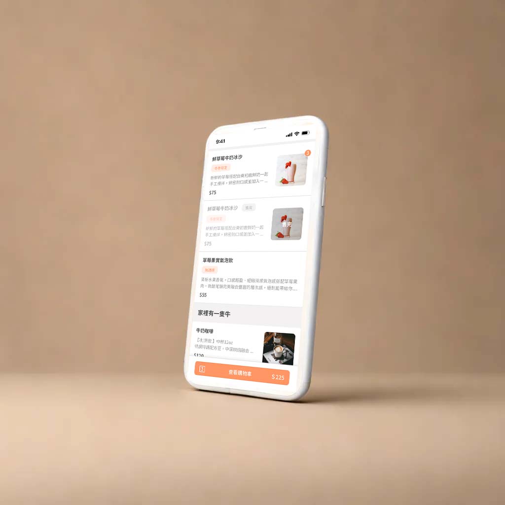
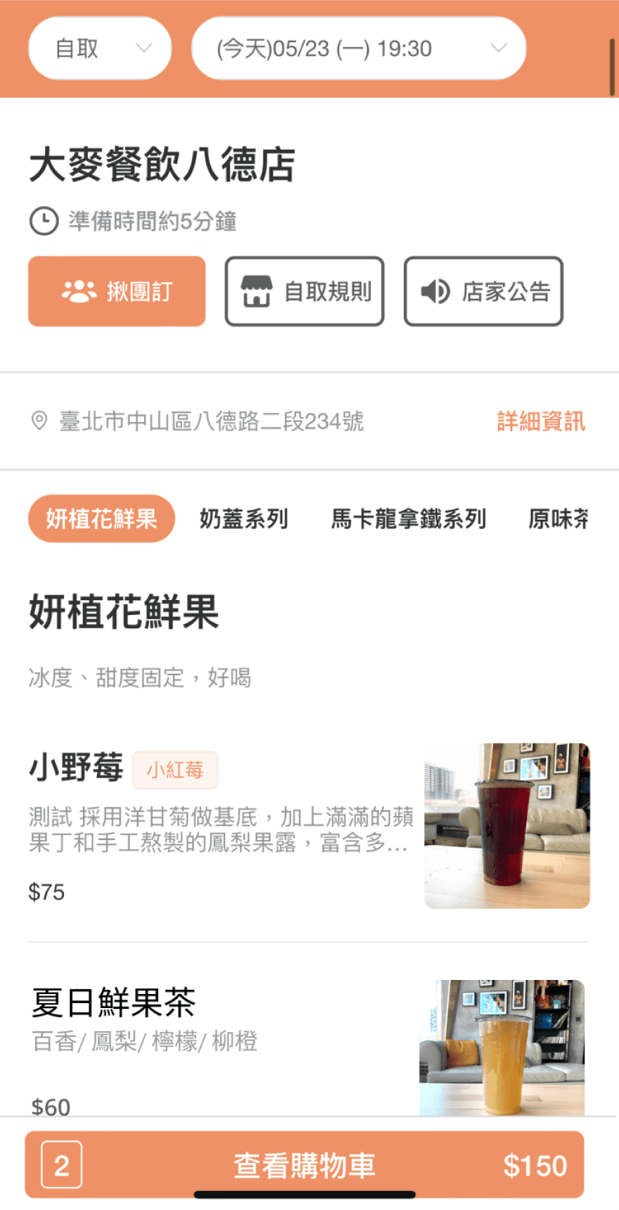
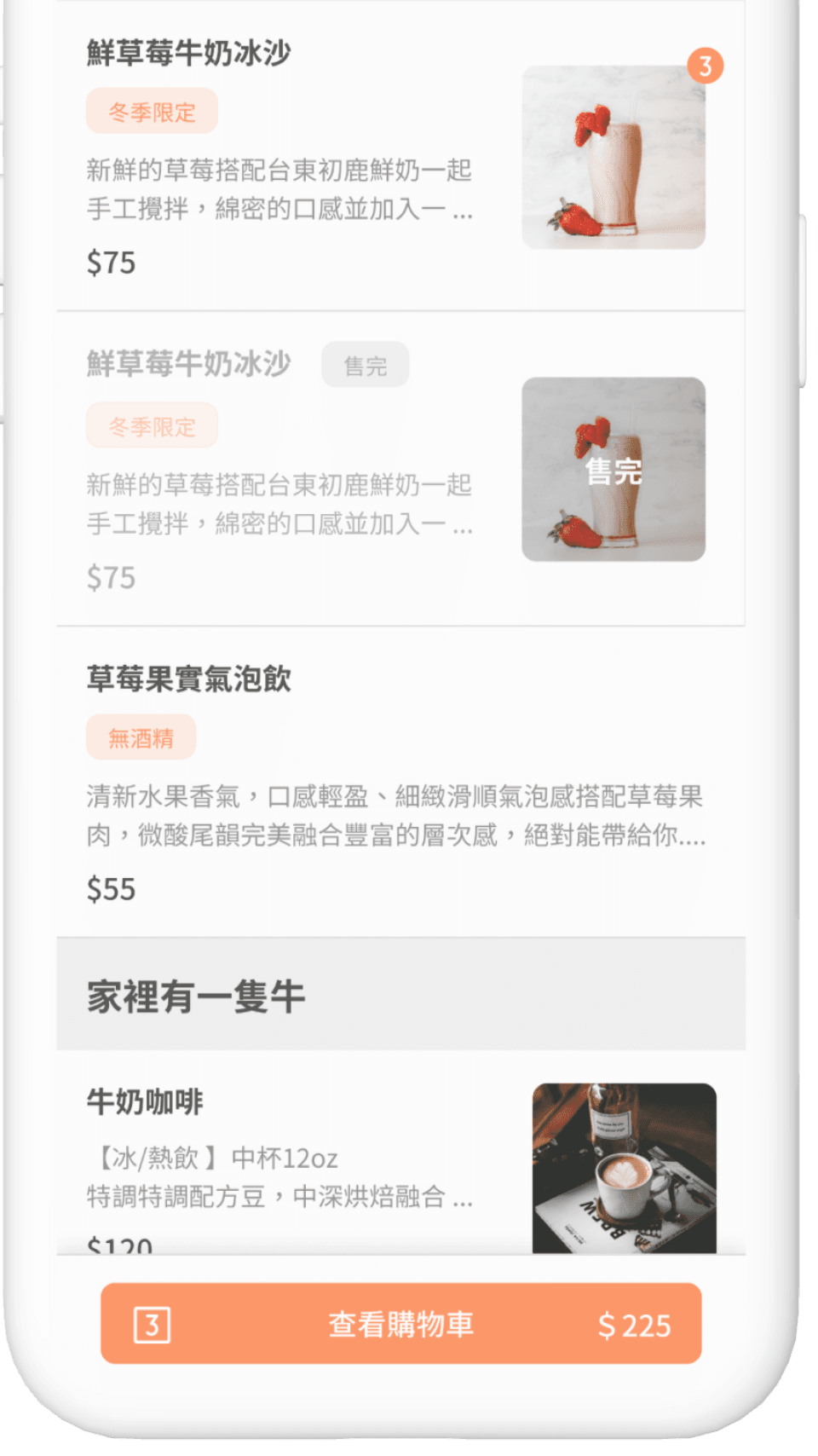
Order Page
Order Page
Add the ability for restaurant clients to increase ad placements and search functions, differentiate the levels on the ordering page, and simplify the interface by focusing key colors on the ordering tasks to enhance user focus.
Add the ability for restaurant clients to increase ad placements and search functions, differentiate the levels on the ordering page, and simplify the interface by focusing key colors on the ordering tasks to enhance user focus.
Before
草本日光
After

Visually separate menu category descriptions
Standardize all components (consistent radius)
De-emphasize secondary functions and distinguish levels of functionality. Reserve the key brand color for the main task ordering on this page.
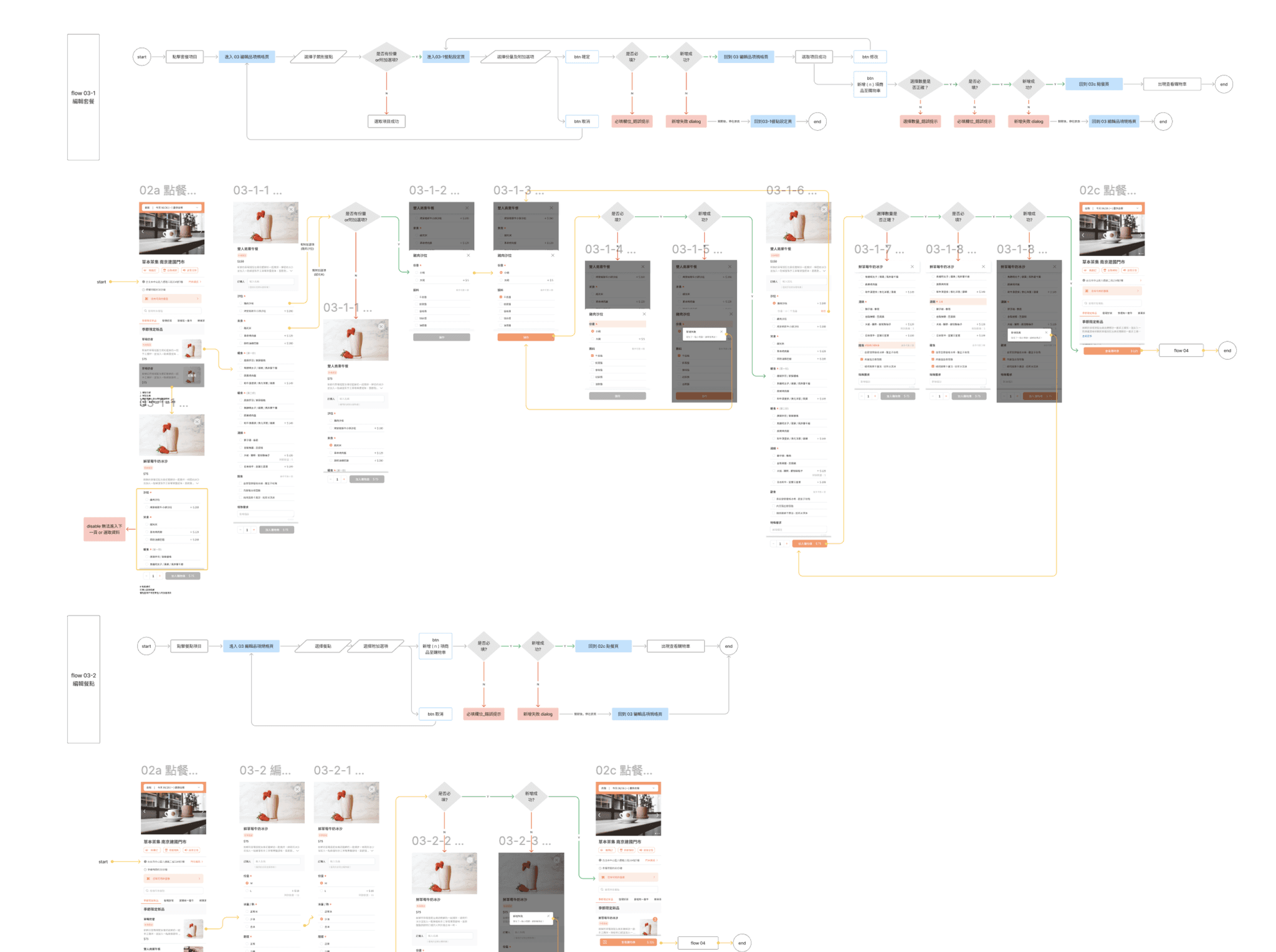
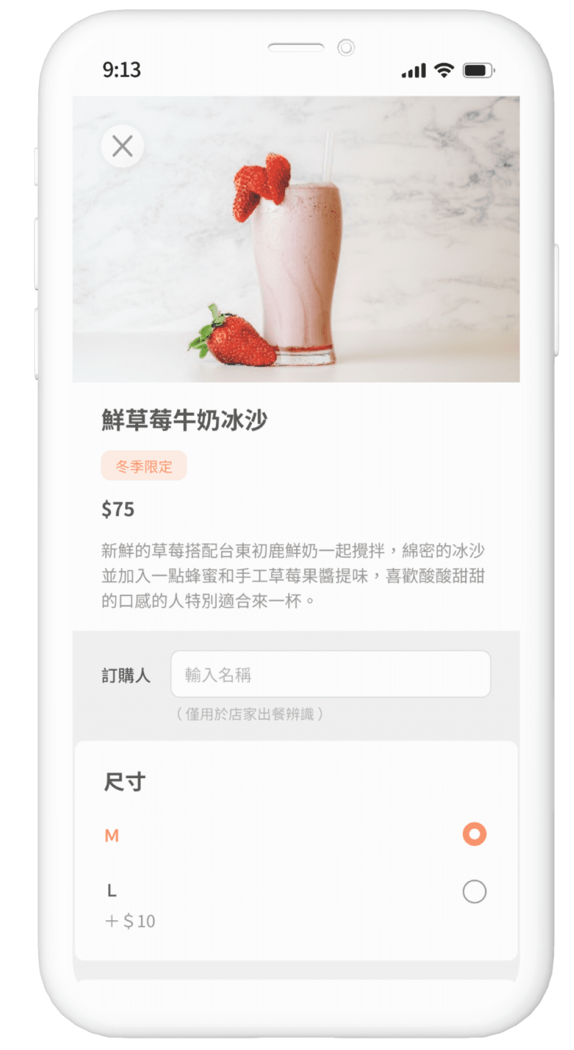
Meal Selection Page
Meal Selection Page
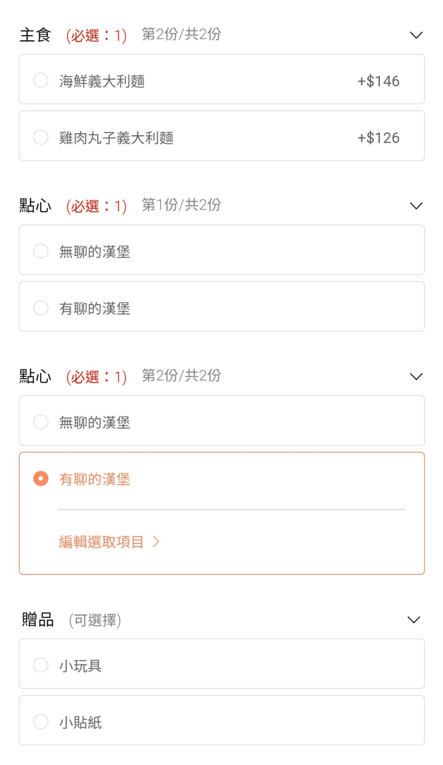
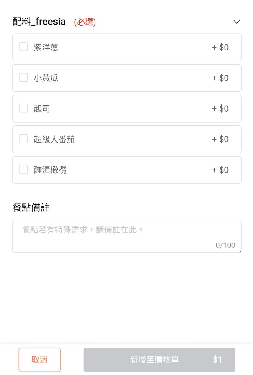
Adjust the position of the close button, clarify mandatory field prompts, and optimize the quantity display location to enhance user interaction flow.
Adjust the position of the close button, clarify mandatory field prompts, and optimize the quantity display location to enhance user interaction flow.
Before

Cathy
額外加選配料

Position the item quantity display below selected items to align with user workflow.
Relocate the close button to distinguish
it from the browser's close button, preventing accidental page closures.
Highlight unselected required items to improve the ordering flow.
After
Eliminate unnecessary lines for a cleaner interface, making additional charges clear.
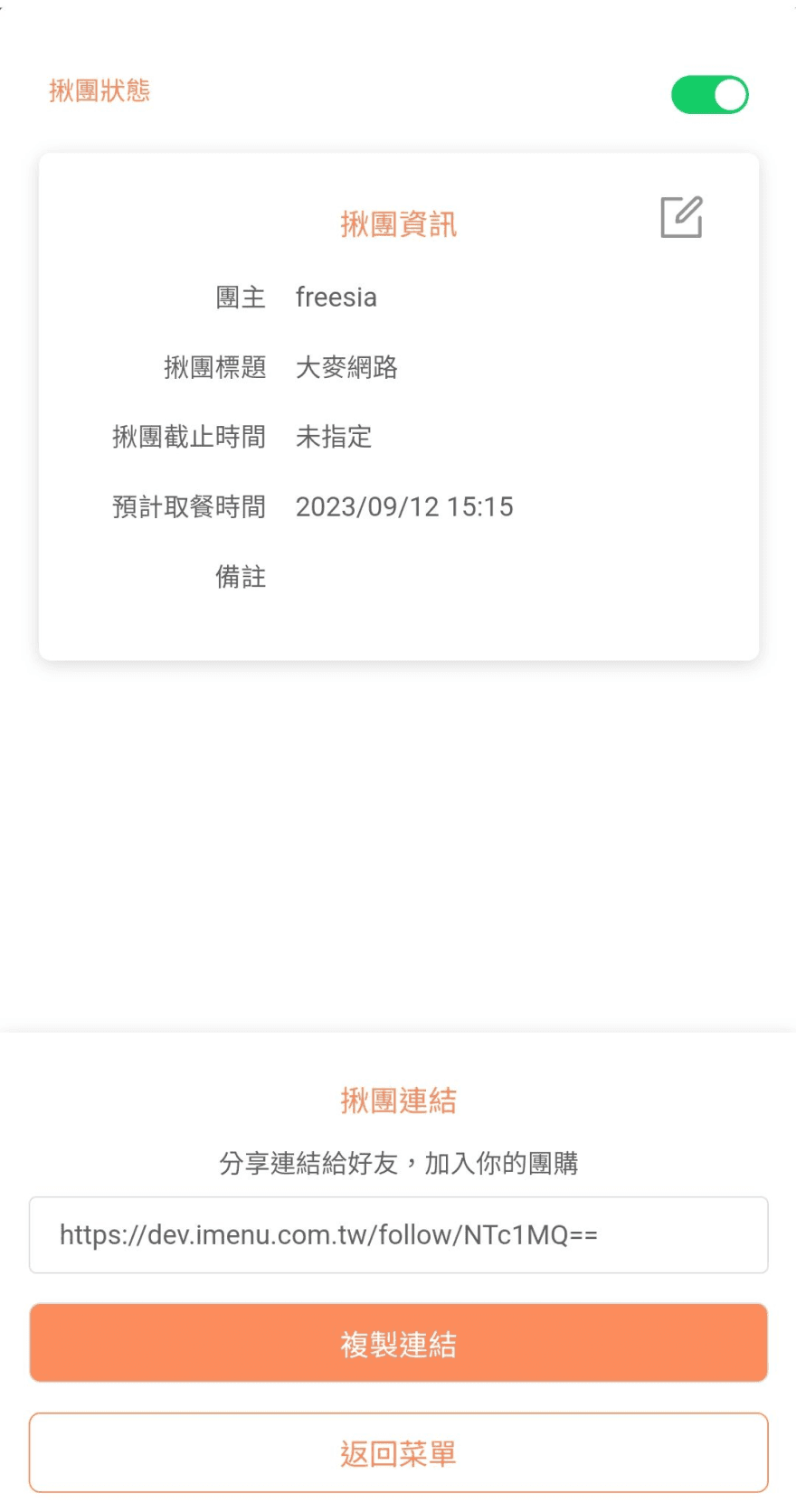
揪團功能 Group Meal Order
Group Meal Order
將切頁改為原頁彈窗,並簡化標題與畫面,提升使用者安心與直覺操作
Change the page to a pop-up on the original page, simplify the title and interface to enhance user comfort and intuitive operation.
Before
Cathy
大家來喝飲料
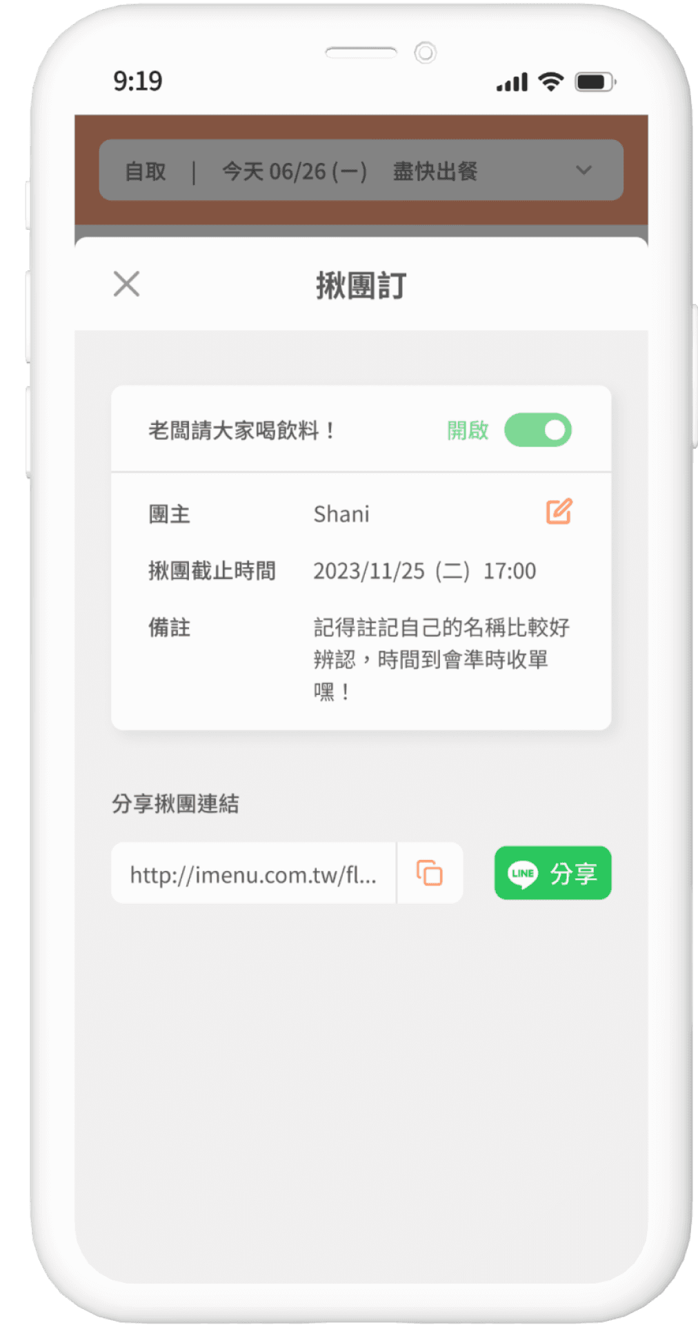
Change the original page to a pop-up for a better user experience.
Simplify function titles
After
Combine the copy link and share icons for a cleaner and more intuitive interface.
Before
Cathy
大家來喝飲料
Group Meal Order
Change the page to a pop-up on the original page, simplify the title and interface to enhance user comfort and intuitive operation.
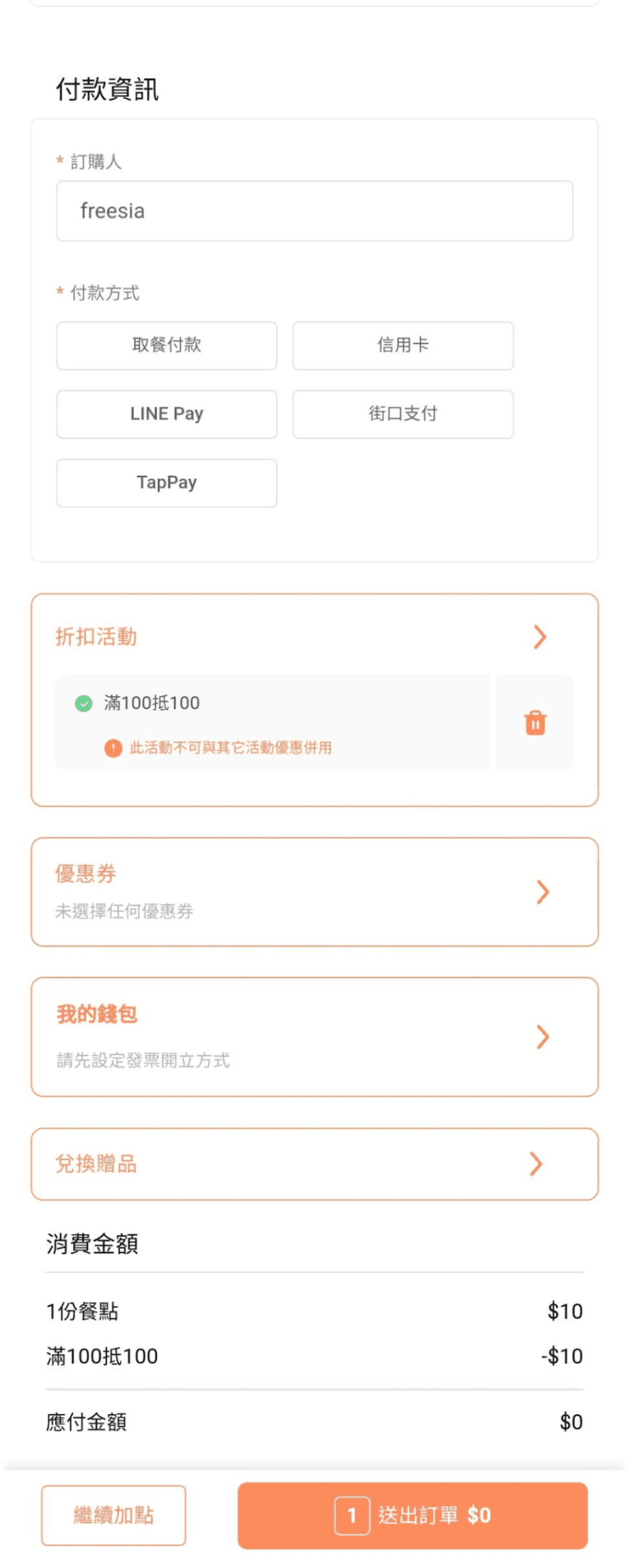
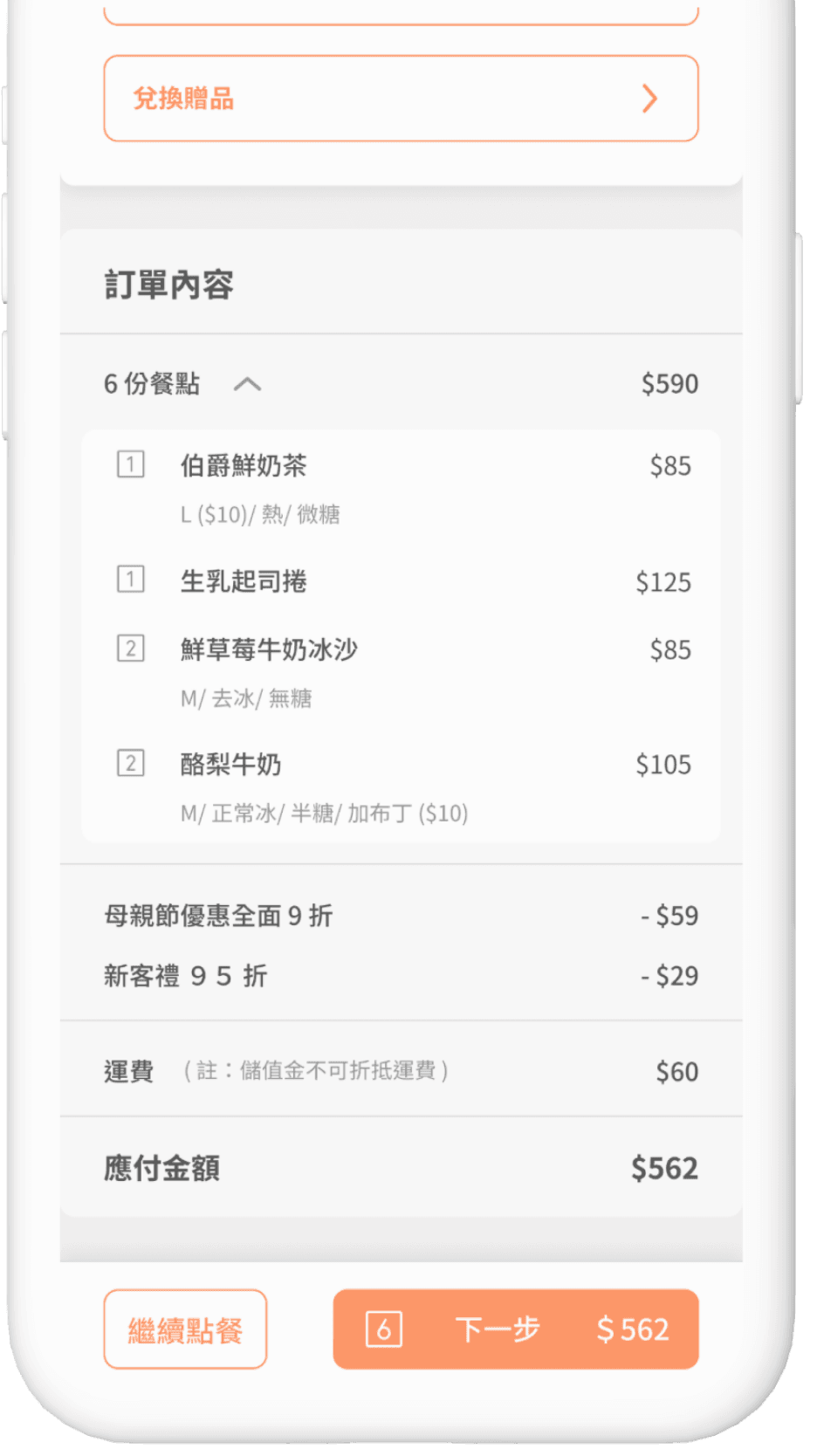
Order Confirmation and Payment
Order Confirmation and Payment
Optimize the checkout process into three steps to guide users in focusing on filling out information and quickly confirming their details, while also adding invoice and member information features.
Optimize the checkout process into three steps to guide users in focusing on filling out information and quickly confirming their details, while also adding invoice and member information features.
Before

草本日光八德店
Cathy
After


Before
After
草本日光
Standardize all components (consistent radius)
Add search function
Visually separate menu category descriptions
Increase ad placements
De-emphasize secondary functions and distinguish levels of functionality. Reserve the key brand color for the main task ordering on this page.
Before
Cathy
額外加選配料
After
Relocate the close button to distinguish it from the browser's close button, preventing accidental page closures.
Eliminate unnecessary lines for a cleaner interface, making additional charges clear.
Highlight unselected required items to improve the ordering flow.
Position the item quantity display below selected items to align with user workflow.
After
草本日光八德店
Cathy
Before
Before
Cathy
大家來喝飲料
After
Simplify function titles
Change the original page to a pop-up for a better user experience.
Add toggle text descriptions to clearly indicate mode status.
Combine the copy link and share icons for a cleaner and more intuitive interface.
Design Guideline
Design Guideline
I established a comprehensive design specification that includes detailed definitions and guidelines, ensuring consistency across all components.
I established a comprehensive design specification that includes detailed definitions and guidelines, ensuring consistency across all components.
Noto Sans TC
H1, 24, Bold
H2, 20, Bold
H2.Medium 20
H3, 18, Bold
H3.Medium, 18
H4, 16, Bold
H4.Medium, 16
H5, 14, Bold
H5.Medium, 14
Body1, 14/150%, Regular
Body2, 12/150%, Regular
#FF9664
#505050
#969696
#B4B4B4
#DCDFE6
#FEF9F3
#FAFAFA
#FFEDE4
#E8E8E8
#F3F1F1

Project Progress
Project Progress
Development Phase
Development Phase
At the start of the project, designers and PMs held multiple discussions, creating prototypes for A/B testing to refine both the process and UI. Engineers had to consider maintenance needs while refactoring, leading to a longer development timeline. The system then underwent extended testing, resolving several bugs.
At the start of the project, designers and PMs held multiple discussions, creating prototypes for A/B testing to refine both the process and UI. Engineers had to consider maintenance needs while refactoring, leading to a longer development timeline. The system then underwent extended testing, resolving several bugs.
Launch Challenges
Launch Challenges
Post-launch, two emergency rollbacks were needed due to issues like failed orders and menu display errors. Once these problems were under control, the team decided not to rollback further.
Post-launch, two emergency rollbacks were needed due to issues like failed orders and menu display errors. Once these problems were under control, the team decided not to rollback further.
Problem Resolution
Problem Resolution
The development team fixed key issues, while the PM, designers, and QA continued testing to ensure smooth operation for all restaurants. This process highlighted the team's collaborative spirit and ability to adapt quickly.
The development team fixed key issues, while the PM, designers, and QA continued testing to ensure smooth operation for all restaurants. This process highlighted the team's collaborative spirit and ability to adapt quickly.
Successful Launch
Successful Launch
The system was eventually launched successfully, receiving positive feedback for its clarity and better user experience, giving the team a strong sense of achievement.
Progressive Iteration and Future Development
The current modifications pertain to Phase 1
Noto Sans TC
H1, 24, Bold
H2, 20, Bold
H2.Medium 20
H3, 18, Bold
H3.Medium, 18
H4, 16, Bold
H4.Medium, 16
H5, 14, Bold
H5.Medium, 14
Body1, 14/150%, Regular
Body2, 12/150%, Regular
#FF9664
#505050
#969696
#B4B4B4
#DCDFE6
#E8E8E8
#F3F1F1
#FEF9F3
#FAFAFA
#FFEDE4
#F3F1F1
Progressive Iteration and Future Development
The current modifications pertain to Phase 1
Phase 1
Phase 2
Phase 3
Ordering process page
Secondary features page
Coupons/ Promotions related
06 Transaction Details Page
07 Order List (Order History)
08-1 Member Information
08-2 My Wallet
08-3 My Loyalty Card
05-2 Discount Promotions
08-4 Coupons
Now it’s here!
01 Pickup Method and Store Page
02 Order Page
03 Meal Selection Page
04 Shopping Cart
05 Order Confirmation and Payment
Ordering process page
Now it’s here!
01 Pickup Method and Store Page
02 Order Page
03 Meal Selection Page
04 Shopping Cart
05 Order Confirmation and Payment
Phase 1
Phase 2
Secondary features page
06 Transaction Details Page
07 Order List (Order History)
08-1 Member Information
08-2 My Wallet
08-3 My Loyalty Card
Phase 3
Coupons/ Promotions
05-2 Discount Promotions
08-4 Coupons
Next steps…
To improve product experience and achieve consistency, we must consider both B-end and C-end users. This involves completing subsequent pages based on technical resource allocation for a better ordering experience.
• Follow-up Optimization Plans for Phases 2 and 3
• Consistency Adjustments in UI (Other Pages)
• Web Version Optimization (RWD)
Phase 1 focused on mobile screen development due to resource allocation.
Insights and Takeaways
Communication and Collaboration During Development
During the project initiation phase, the business department presented various system improvement requests from restaurant clients and consumers. However, the technical department needed to prioritize internal system adjustments and operational demands, which delayed progress. To address this, the product department held multiple meetings for cross-department coordination, dividing the ordering system into three parts and setting achievable launch goals to ensure alignment.
As a UI/UX designer, I conducted a thorough analysis of several competitors, evaluating their strengths and weaknesses. I collaborated with my team to discuss strategies for improving user issues without altering the existing system processes. Throughout this process, I focused on balancing design direction with business needs to enhance the overall user experience, effectively demonstrating my professional expertise.
Key Learnings and Reflections
This optimization project for the online ordering system highlighted the importance of effective communication and collaboration. While improving the outdated interface and processes, I learned to balance differing opinions and adapt to changes. This experience reinforced the value of continuous learning and an open mindset for enhancing design quality and fostering innovation in future projects.
Interested in connecting ?
Let’s talk projects, collaborations, or anything design !